Bootstrap Tables Class
Introduction
Tables are present in the majority of the applications (web, desktop or mobile application) and they are a key element in providing records to the end user. The HTML tables are really used to present info in framework method like columns and rows . With using Bootstrap 4 framework you are capable to easily improve the appearance of the table.
These days, with the significance that the user interface has, understanding precisely how to improve the visual appeal of a Bootstrap table becomes as relevant as it is. In this case, one of the systems that have come to be reference is Bootstrap. This front-end framework, among lots of other features , provides a variety of features for styling and optimising the display of various components, such as tables.
Basic table in Bootstrap
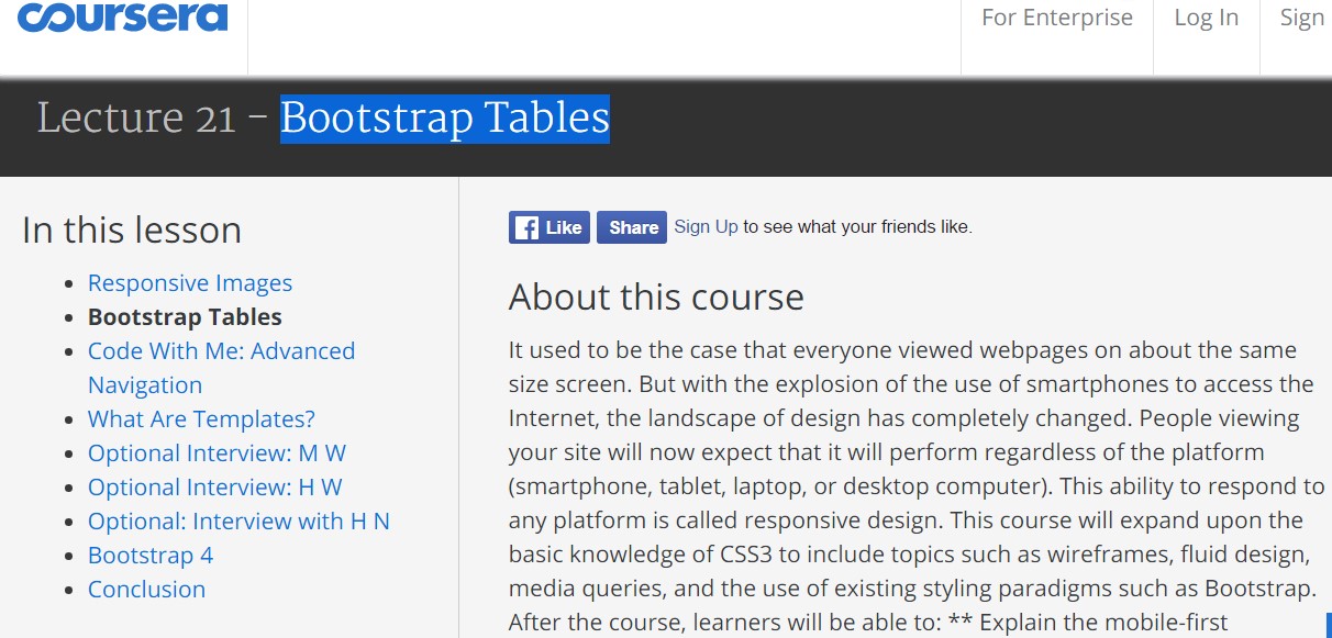
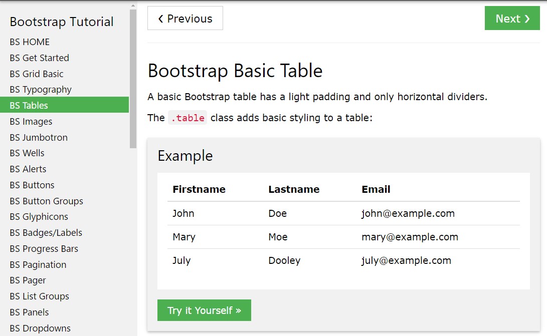
To form a table by using Bootstrap, simply provide the table class to the
<table>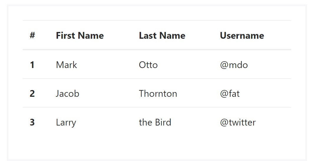
<table class="table">
  <thead>
    <tr>
      <th>#</th>
      <th>First Name</th>
      <th>Last Name</th>
      <th>Username</th>
    </tr>
  </thead>
  <tbody>
    <tr>
      <th scope="row">1</th>
      <td>Mark</td>
      <td>Otto</td>
      <td>@mdo</td>
    </tr>
    <tr>
      <th scope="row">2</th>
      <td>Jacob</td>
      <td>Thornton</td>
      <td>@fat</td>
    </tr>
    <tr>
      <th scope="row">3</th>
      <td>Larry</td>
      <td>the Bird</td>
      <td>@twitter</td>
    </tr>
  </tbody>
</table>
Inverse tables.
Among the new tables in Bootsrap 4 is the inverse tables. Class
.table-inverse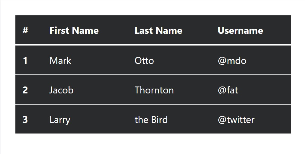
<table class="table table-inverse">
  <thead>
    <tr>
      <th>#</th>
      <th>First Name</th>
      <th>Last Name</th>
      <th>Username</th>
    </tr>
  </thead>
  <tbody>
    <tr>
      <th scope="row">1</th>
      <td>Mark</td>
      <td>Otto</td>
      <td>@mdo</td>
    </tr>
    <tr>
      <th scope="row">2</th>
      <td>Jacob</td>
      <td>Thornton</td>
      <td>@fat</td>
    </tr>
    <tr>
      <th scope="row">3</th>
      <td>Larry</td>
      <td>the Bird</td>
      <td>@twitter</td>
    </tr>
  </tbody>
</table>
Extra classes
For tables there are additionally some classes that help you to apply different styles to a table ( click this link), they are:
●
table-striped●
table-bordered●
table-hover●
table-condensedTo apply all of these looks, simply add in the desired classes to the: <table>: <table class="table table-striped table-bordered table-condensed table-hover">
Table head options
Like default and inverse tables, put into action one of two modifier classes to get
<thead>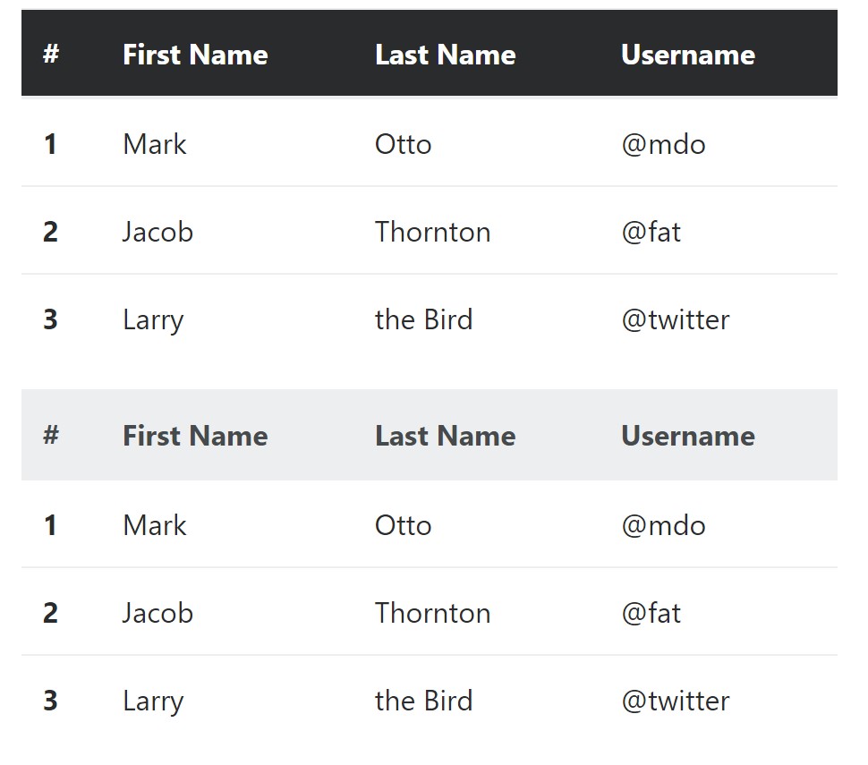
<table class="table">
  <thead class="thead-inverse">
    <tr>
      <th>#</th>
      <th>First Name</th>
      <th>Last Name</th>
      <th>Username</th>
    </tr>
  </thead>
  <tbody>
    <tr>
      <th scope="row">1</th>
      <td>Mark</td>
      <td>Otto</td>
      <td>@mdo</td>
    </tr>
    <tr>
      <th scope="row">2</th>
      <td>Jacob</td>
      <td>Thornton</td>
      <td>@fat</td>
    </tr>
    <tr>
      <th scope="row">3</th>
      <td>Larry</td>
      <td>the Bird</td>
      <td>@twitter</td>
    </tr>
  </tbody>
</table>

<table class="table">
  <thead class="thead-default">
    <tr>
      <th>#</th>
      <th>First Name</th>
      <th>Last Name</th>
      <th>Username</th>
    </tr>
  </thead>
  <tbody>
    <tr>
      <th scope="row">1</th>
      <td>Mark</td>
      <td>Otto</td>
      <td>@mdo</td>
    </tr>
    <tr>
      <th scope="row">2</th>
      <td>Jacob</td>
      <td>Thornton</td>
      <td>@fat</td>
    </tr>
    <tr>
      <th scope="row">3</th>
      <td>Larry</td>
      <td>the Bird</td>
      <td>@twitter</td>
    </tr>
  </tbody>
</table>
Striped rows
Zebra-like stripes may be brought with the
.table-striped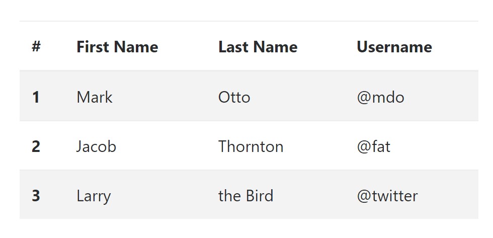
<table class="table table-striped">
  <thead>
    <tr>
      <th>#</th>
      <th>First Name</th>
      <th>Last Name</th>
      <th>Username</th>
    </tr>
  </thead>
  <tbody>
    <tr>
      <th scope="row">1</th>
      <td>Mark</td>
      <td>Otto</td>
      <td>@mdo</td>
    </tr>
    <tr>
      <th scope="row">2</th>
      <td>Jacob</td>
      <td>Thornton</td>
      <td>@fat</td>
    </tr>
    <tr>
      <th scope="row">3</th>
      <td>Larry</td>
      <td>the Bird</td>
      <td>@twitter</td>
    </tr>
  </tbody>
</table>
Hover Rows
To make a hover effect in the rows of your table add in the
.table-hover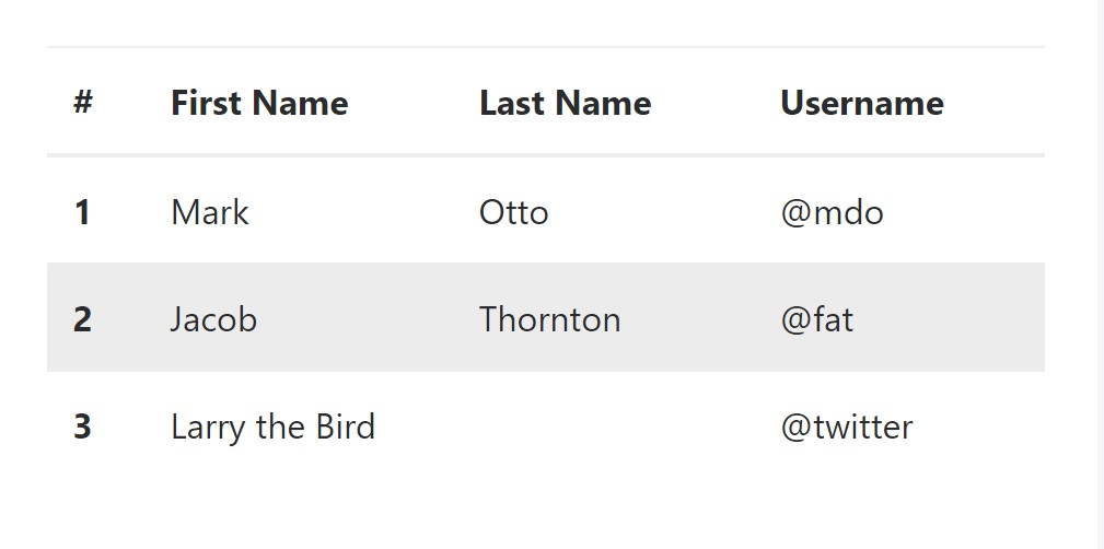
<table class="table table-hover">
  <thead>
    <tr>
      <th>#</th>
      <th>First Name</th>
      <th>Last Name</th>
      <th>Username</th>
    </tr>
  </thead>
  <tbody>
    <tr>
      <th scope="row">1</th>
      <td>Mark</td>
      <td>Otto</td>
      <td>@mdo</td>
    </tr>
    <tr>
      <th scope="row">2</th>
      <td>Jacob</td>
      <td>Thornton</td>
      <td>@fat</td>
    </tr>
    <tr>
      <th scope="row">3</th>
      <td colspan="2">Larry the Bird</td>
      <td>@twitter</td>
    </tr>
  </tbody>
</table>
Bordered Table
You can certainly bring in the borders on every table slide and a cell by the
.table-bordered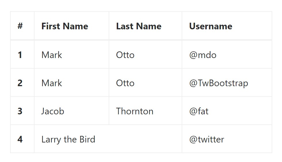
<table class="table table-bordered">
  <thead>
    <tr>
      <th>#</th>
      <th>First Name</th>
      <th>Last Name</th>
      <th>Username</th>
    </tr>
  </thead>
  <tbody>
    <tr>
      <th scope="row">1</th>
      <td>Mark</td>
      <td>Otto</td>
      <td>@mdo</td>
    </tr>
    <tr>
      <th scope="row">2</th>
      <td>Mark</td>
      <td>Otto</td>
      <td>@TwBootstrap</td>
    </tr>
    <tr>
      <th scope="row">3</th>
      <td>Jacob</td>
      <td>Thornton</td>
      <td>@fat</td>
    </tr>
    <tr>
      <th scope="row">4</th>
      <td colspan="2">Larry the Bird</td>
      <td>@twitter</td>
    </tr>
  </tbody>
</table>
Short Table
In case that you intend to make your table more small - on that occasion you are able to cut cell padding in half with this class:
.table-condensedBear in mind that, while Bootstrap 4 uses
.table-sm.table-condensed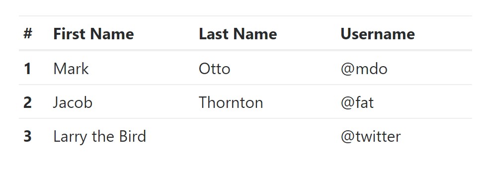
<table class="table table-sm">
  <thead>
    <tr>
      <th>#</th>
      <th>First Name</th>
      <th>Last Name</th>
      <th>Username</th>
    </tr>
  </thead>
  <tbody>
    <tr>
      <th scope="row">1</th>
      <td>Mark</td>
      <td>Otto</td>
      <td>@mdo</td>
    </tr>
    <tr>
      <th scope="row">2</th>
      <td>Jacob</td>
      <td>Thornton</td>
      <td>@fat</td>
    </tr>
    <tr>
      <th scope="row">3</th>
      <td colspan="2">Larry the Bird</td>
      <td>@twitter</td>
    </tr>
  </tbody>
</table>
Contextual Classes of Bootstrap Tables Datatable
Use the contextual classes to color a table cells (
<td><tr>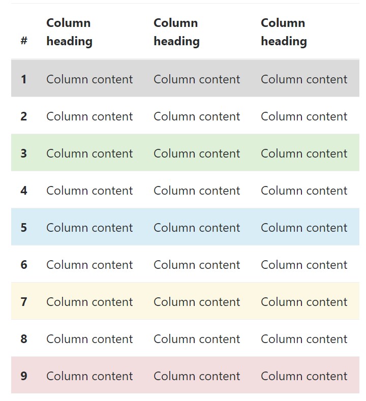
<!-- On rows -->
<tr class="table-active">...</tr>
<tr class="table-success">...</tr>
<tr class="table-warning">...</tr>
<tr class="table-danger">...</tr>
<tr class="table-info">...</tr>

<!-- On cells (`td` or `th`) -->
<tr>
  <td class="table-active">...</td>
  <td class="table-success">...</td>
  <td class="table-warning">...</td>
  <td class="table-danger">...</td>
  <td class="table-info">...</td>
</tr>
Changing the rows of a table Bootstrap 3 does not make use of the
.table-.active.table-active● active: Applies the focus coloring to the table row or table cell
● success: Signifies a positive or successful action
● info: Indicates a neutral information change or action
● warning: Indicates a caution that you may need attention
● danger: Indicates a potentially negative or dangerous action
Responsive Tables
To create a responsive table - use the
.table-responsive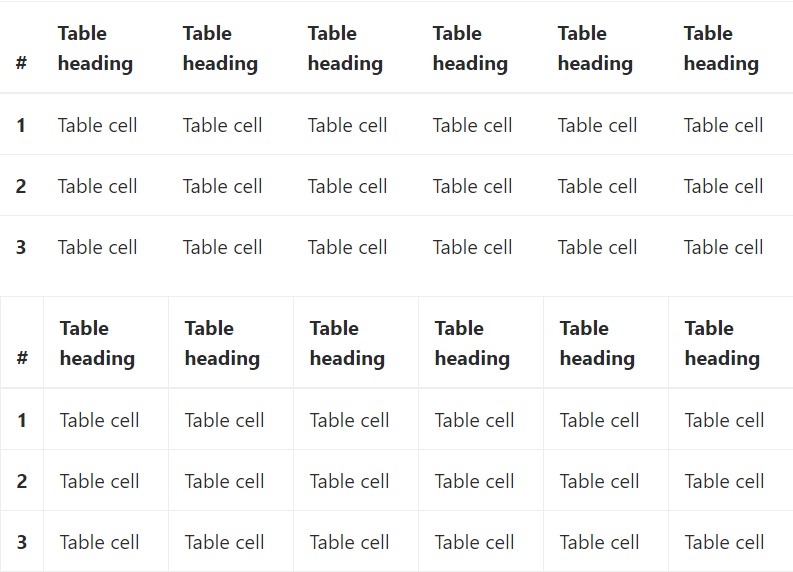
Bootstrap 4 allows you to add the
.table-responsiveCheck out several youtube video tutorials regarding Bootstrap 4 tables
Connected topics:
Bootstrap Table Responsive
__
W3schools:Bootstrap table tutorial
Bootstrap Tables Lecture